GramCity
This project took on after the Google Ventures Design Sprint style, therefore I had 5 days to understand, sketch, storyboard, prototype and test my solution. Specifically, I was designated the task of designing a feature for the GramCity mobile application. GramCity is a photo editing app that helps users perfect their images before sharing them on their social media platform of choice. This application strives to explore how and where they can help their users find great photo opportunities. Furthermore, GramCity aims to create an active community of users to find and share locations, therefore my solution was a feature to aid users in this process.
With the aims and design constraints outlined by GramCity, my approach was to create a feature that was simple, communal, and artistic. As this was a project I performed independently, I completed each day of the sprint on my own, from user research to testing. Overall, this design spring taught me how to be flush an idea out quickly and effectively but I do know that this prototype created is not at its highest fidelity.
Day 1 (Understand/Map)
On the first day, I spent it understanding GramCity and the task that I have been delegated. This required me learning more about the company itself, their goals, as well as user personas of GramCity through interviews they had.
The persona interviewing had individuals answer the question “Tell us about how you find great new places to take a photo.” Some research highlights are that certain individuals when in a new place want to get “instagrammable” photos, but don’t wish to spend the time looking for it all over the city and therefore settle on places that are near them. On the other hand, there are individuals who are willing to travel the distance to find amazing locations for photos. There are people who like to capture famous sights and landmarks when travelling somewhere new, while there are others who find specific places that have significant meaning or of interest to them despite being well-recognized. A few like to plan out exactly where they will be going to take photos, while there is a contrast to those who simply capture scenes in the moment.
User Personas and Ideas
Sarah:
Behavior: Sarah travels a lot for her job, and with her spare time between events in new cities likes to take photos after participating in a photography class a few years prior. As a person who likes to plan her days around the photos she wants to take, prior to travelling Sarah will take time looking through social media sites such as Pinterest and Instagram to get inspiration.
Frustrations: Sarah doesn’t have much time in one city, and therefore strives to get the best images when she is there. Though she isn’t bothered by travelling long distances for a great photo, she feels like she has wasted her time if the place isn’t what she expected. Sarah dedicates a lot of time looking through other people’s photos to find places, and if it isn’t well known finding the details on the location will be even more time consuming. She also likes to see different ways people take photos of the same place, but doesn’t want to waste time scrolling through “average” photos to find good ones.
Goals: Sarah wants to have an easy way to find locations and examples of the best photo opportunities the city provides, which would make her planning process much smoother.
Nick:
Behavior: Nick is someone who takes a lot of road trips everywhere, thoroughly enjoys traveling, documenting, and sharing his images with friends and social media. When in a new place, Nick will spend a bulk of his time exploring for most of the day and doesn’t feel the need to have a set plan of where he will go.
Frustrations: Nick sometimes struggles to find a balance between regretting not taking enough pictures, and missing out on the true traveling experience if he is spending too much time taking pictures. He likes to take a few photos of activities that he is doing, but also gets irritated that he may have missed out on photo opportunities that were near him.
Goals: Nick loves to find places to document and capture photos of his trips, but he also doesn’t want to trouble himself to spend time finding or travelling far to these places.
Possible end-to-end experiences
Ideas:
A snap map view of photos posted where, and then people rating other people’s photos or liking it and pushing it as a place you should take photos
Individual profiles can show where they have travelled and the places and then people can look through those profiles to see the photos they have posted where they have taken it
Different forums for locations for photo taking where individuals can share the different places they have been
Day 2 (Sketch Solution)
Lightning Demos
In order to start sketching solutions, I conducted a solo-version lightning demo. I looked at solutions competitors have produced to solve the problem of finding photo worthy locations, as well as any related products for inspiration.
I conducted lightning demos of Instagram, Pinterest, Google and Yelp.
As one of my possible ideas was utilizing user profiles and drawing inspiration from locations tagged in their images, I wanted to find inspiration in how that could be executed. On Instagram, a user is able to also look through profiles of individuals to see types of photos taken and where it was taken. Instagram also utilizes multiple search filters such as tagged locations. I really like how Instagram uses the map function when looking through tagged locations. This aided me in the process of trying to help GramCity users find instructions on how to get to certain locations, which would then provide the necessary time required for travel.
From Pinterest, I took inspiration in terms of how images take a much greater priority over text as well as their save feature. For GramCity I wanted to make it so that individuals can arrange saved images into different “collections.”
Yelp was useful for the review aspect of my application. One of the frustrations that users have was not knowing whether certain locations were worth visiting. I like that Yelp provides a star rating system, and aids individuals in participation for certain services.
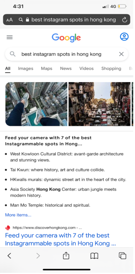
Google being a main search engine I wanted to visualize how they are able to demonstrate a mass amount of information in a clear and orderly way.
Crazy 8 Exercise
In the above image I sketched 8 possible solutions using the Crazy 8 method. Within the 8 screens that I drew, I chose the 5th sketch as the most critical screen.
I believe that this incorporates what GramCity is looking for the most. It creates an active community between the users as they share their photos as well as others being able to comment, and share their experiences. As seen in the sketch this is the interaction under “Hong Kong Chat Forum”, therefore making it specific to those who are travelling to Hong Kong. Furthermore, it incorporates the idea of GramCity users' profiles being visible.
Solution Sketch
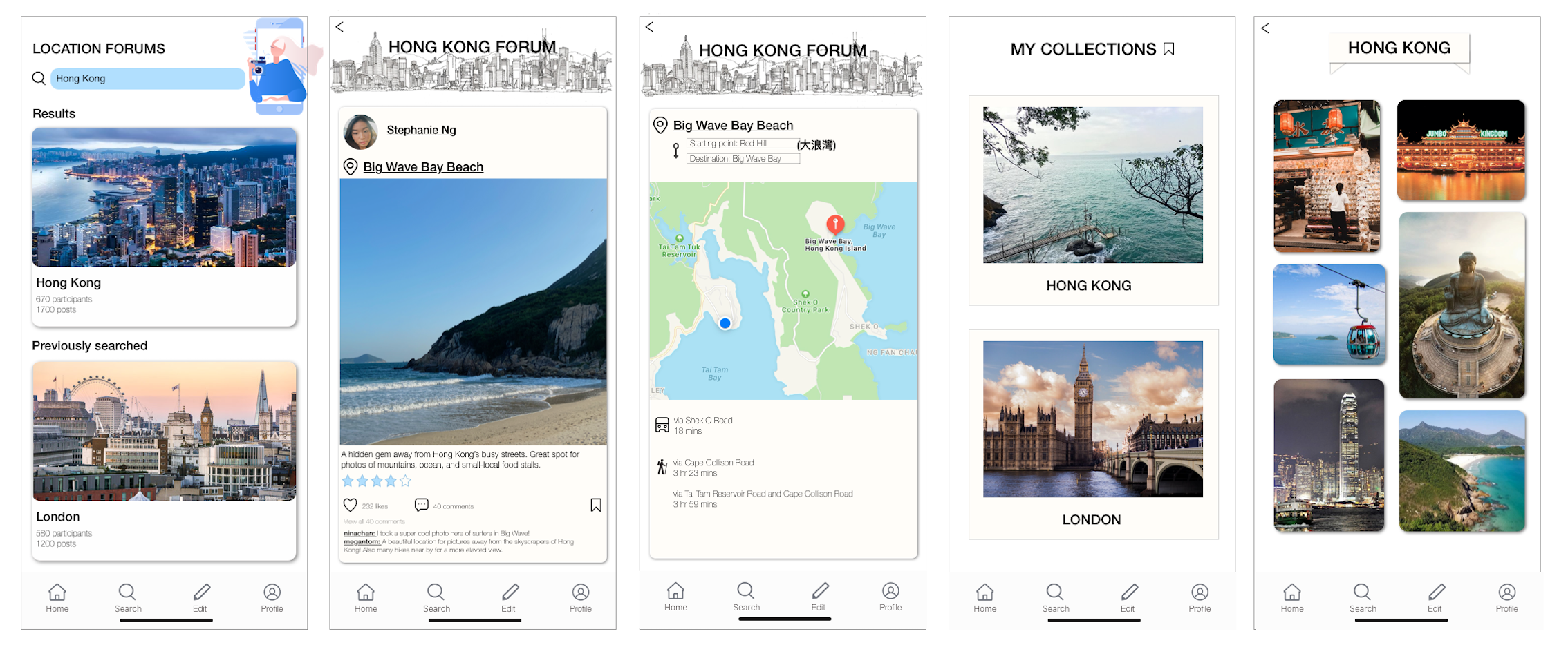
This is the three-panel board solution sketch I drew with the middle panel as the critical screen itself. The first panel shows individuals searching for their specific city forum they wish to visit. As shown in the search bar, the user inputted “Hong Kong” and the resulting forum was shown. Below that it showed previously viewed forums by the user as well. The second panel shows a specific post made by a user alongside images, reviews, location, and engagement from other users. The last panel shows the GramCity individual’s profile with a “saved” board intended for later use.
Day 3 (Decide/Storyboard)
Storyboard
When creating the storyboard I had essential elements that I wanted to include. First of all, I wanted to demonstrate how forums would work. There would be a news feed of posts from different users and also displaying that others can interact with posts through likes and comments. Furthermore, I as a user am able to expand on that post and save it to a specific collection. Users are able to create collections for certain places they wish to visit and then have a compilation of locations and photo references in the collection. As you can see in the account page, there are multiple locations (London, Madrid, Hanoi, Hong Kong), and upon expanding one there is a main photo with the location.
Day 4 (Prototype)
Originally, these were some of the wireframes that I created. I used Marvel to create these two screens that I decided to display. In the first image, this is how I intended the location forum to look. There is an obvious search bar, search results, and previously searched. After choosing the relevant forum, the expanded page included six posts. Each post included a photo, location tag, profile image, profile name, likes, and comments. The posts are able to be blown-up across the screen, profiles are linked, and the comments and likes are interactable with other users.
To be honest, I didn’t enjoy this prototype process using Marvel as I thought it limited what I can and cannot do. Therefore I decided to do a few wireframes only and quickly proceed to testing, and reiterate my designs on Sketch after receiving necessary feedback.
Day 5 (Test)
In order to validate and improve my design, I recruited 5 individuals to interview. All 5 individuals were people I knew who had a big social media presence, and enjoyed travelling and photography. There were male and females within the mix, and aged between 16-27 years old.
My experience interviewing was quite interesting. Due to Covid, I arranged some of the interviews to be done over Zoom and others to be one-on-one meet ups in person. I made sure that the environment was relaxed and comfortable to ensure honest feedback.
Though individuals loved the direction that I was heading in, and thought that it was a great idea, I received a wide range of feedback regarding my prototype. Most of the interviewees found that the forum display was not breathable, and made them feel overwhelmed as they couldn’t focus on one single post. Contributing to the dense experience icons, buttons, and text were too small. Users found it difficult to navigate between pages, and wished there was more feedback when trying to dive deeper within the page. As previously mentioned, I decided to do testing quite urgently as I wanted to switch to a different platform to do my prototype, therefore a lot of users also asked for a more flushed out prototype.
In response to the feedback that I received, I was very ready to reiterate my prototype as that was my original plan. In moving forward, I found that the overall concept is well done, but can be much improved. To begin, I wish to create a more “card” like design, and only have one post displayed per page to make it a more pleasant experience. By making each screen less compact, I am then able to expand texts, images, and buttons to help make the UI and UX smoother and easier to navigate. Furthermore, I recognize how important it is to have a simple navigation bar. The addition of this navigation bar will help show users it is only a feature of the application, and help them go between desired screens easier. By reiterating my design on a different application where I don’t feel restricted, I will also be able to show more flushed out screens and interactions available.
Further Iteration
As I was only meant to spend a maximum of a couple hours per day for the 5 days this is the furthest iteration that I had after the design sprint.


